Project: The Gutter Review
First Iteration
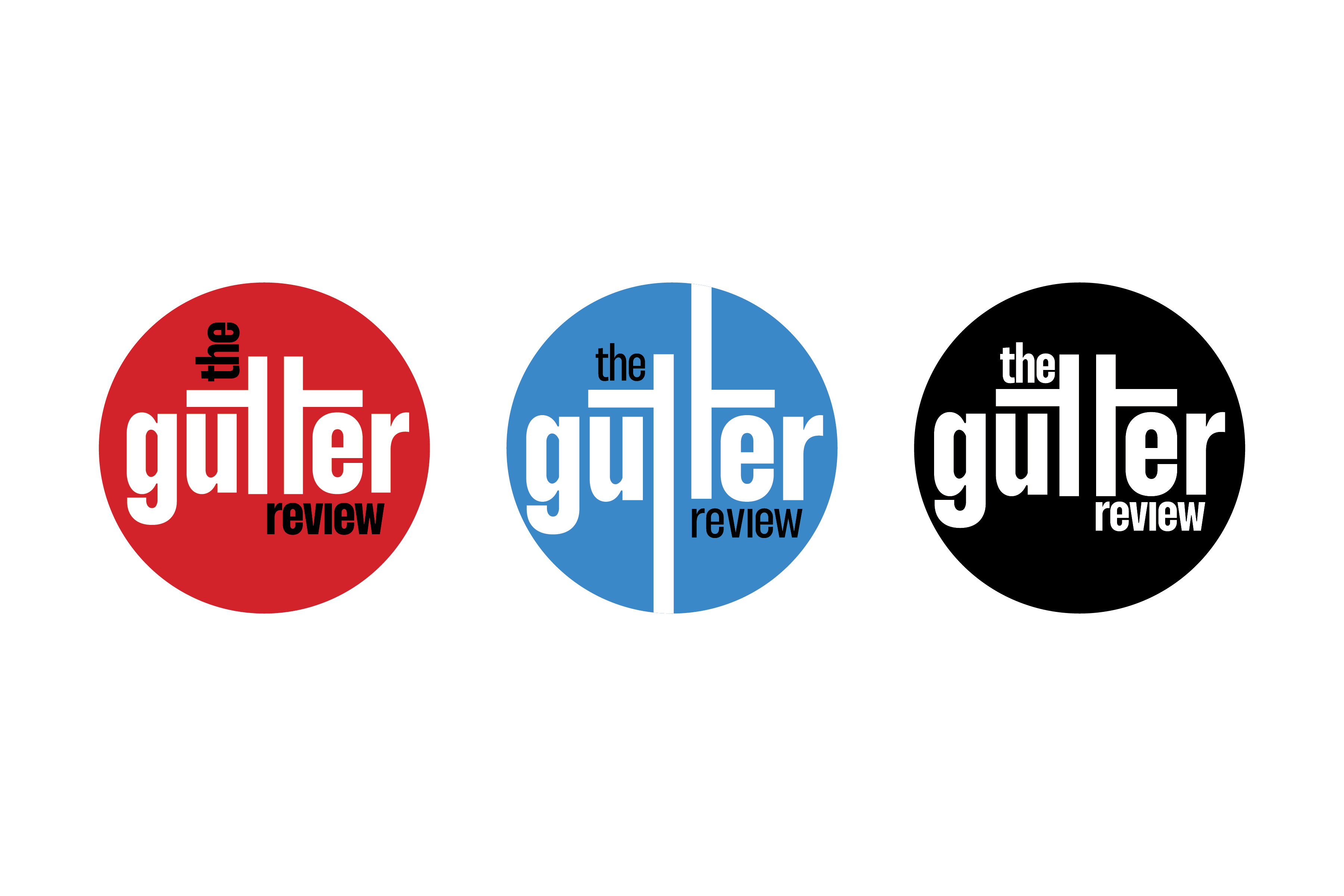
In 2023 I began working on a rebranding project for the not-for-profit comic book journal The Gutter Review. Before getting the owners perspective I decided to do some research and look at potential directions we could go in.
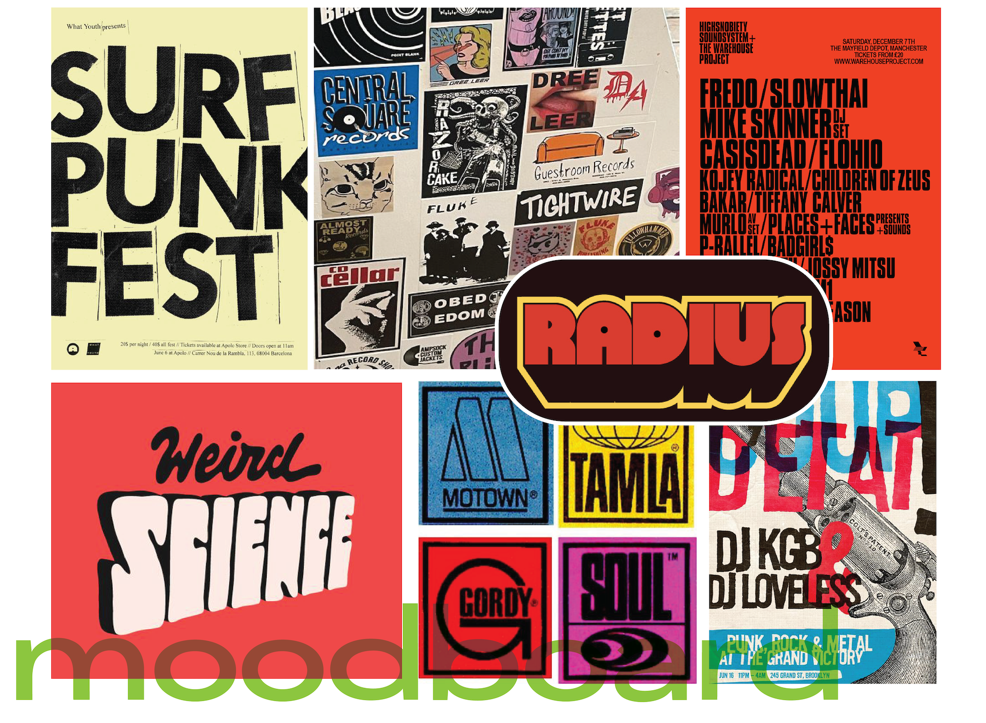
The content and interests of the journal very much skewed towards 80s British punk and anti-establishment themes which I took into consideration while trying to create a look that was unique and suitable for small merchandise such as stickers. After putting together a moodboard I decided to work on a wordmark first, and then base other brand elements around it.
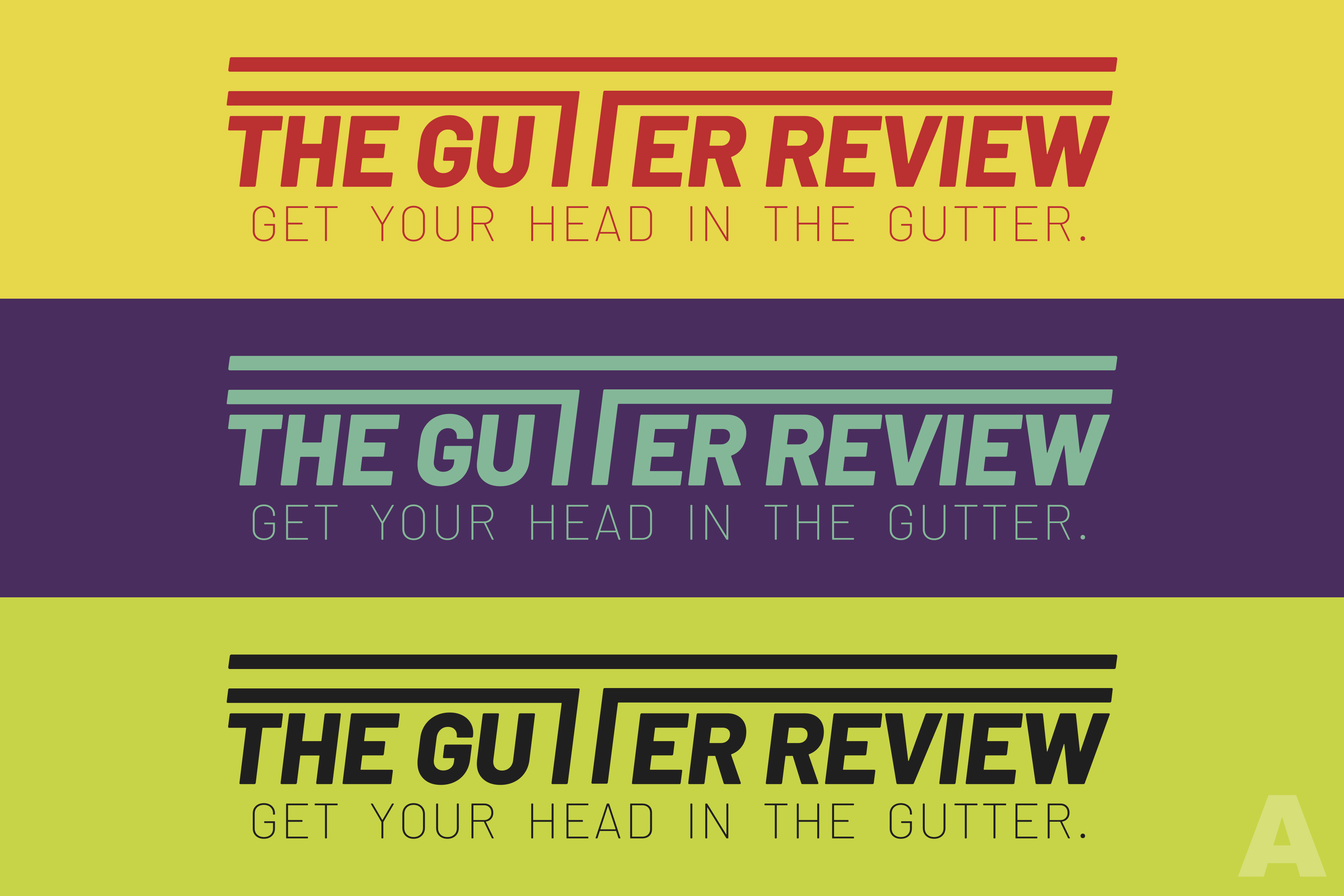
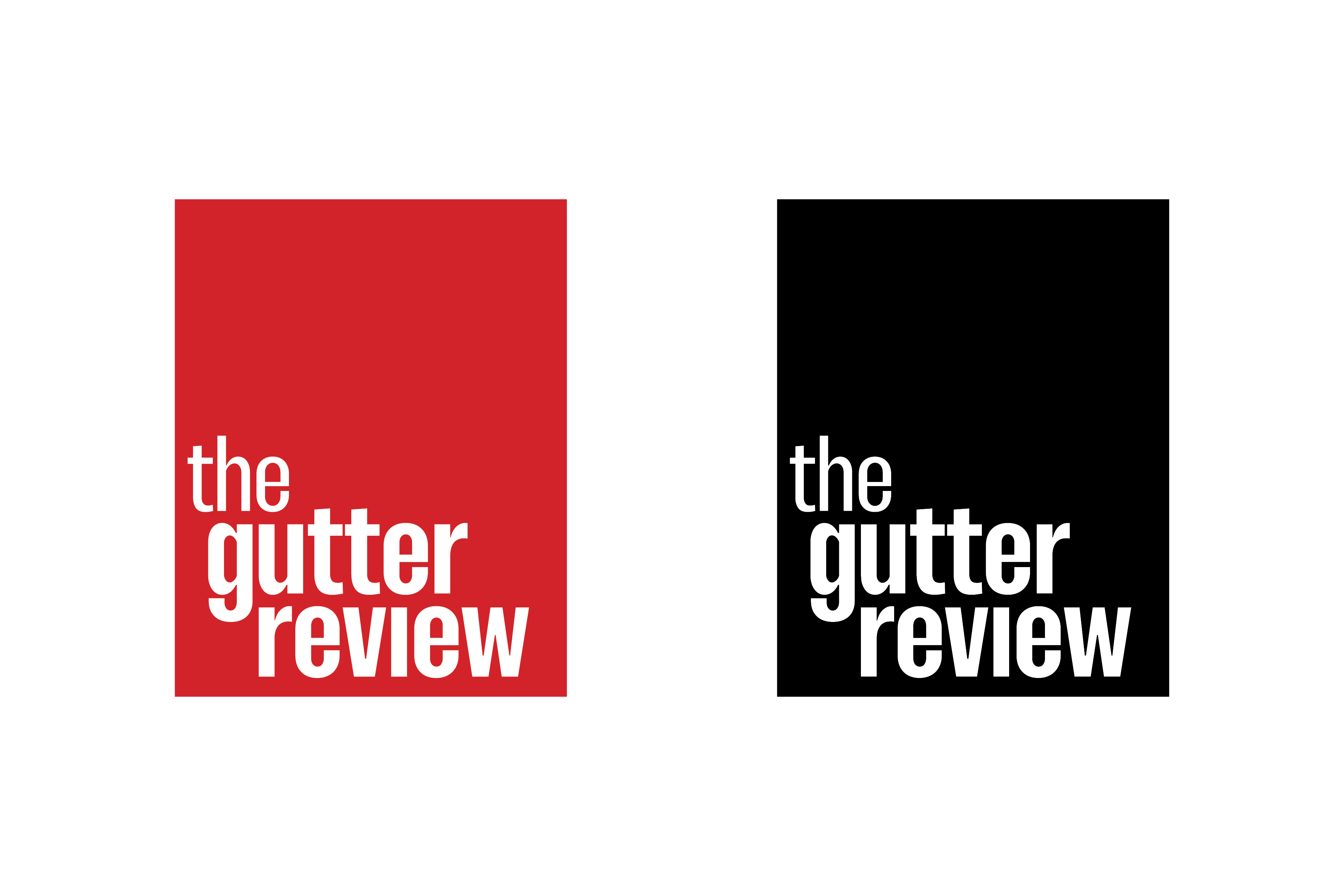
The "gutter" in "The Gutter Review" refers to the white space in between the panels of a comic. I tried to capture this visual in a few of my wordmarks.
Second Iteration
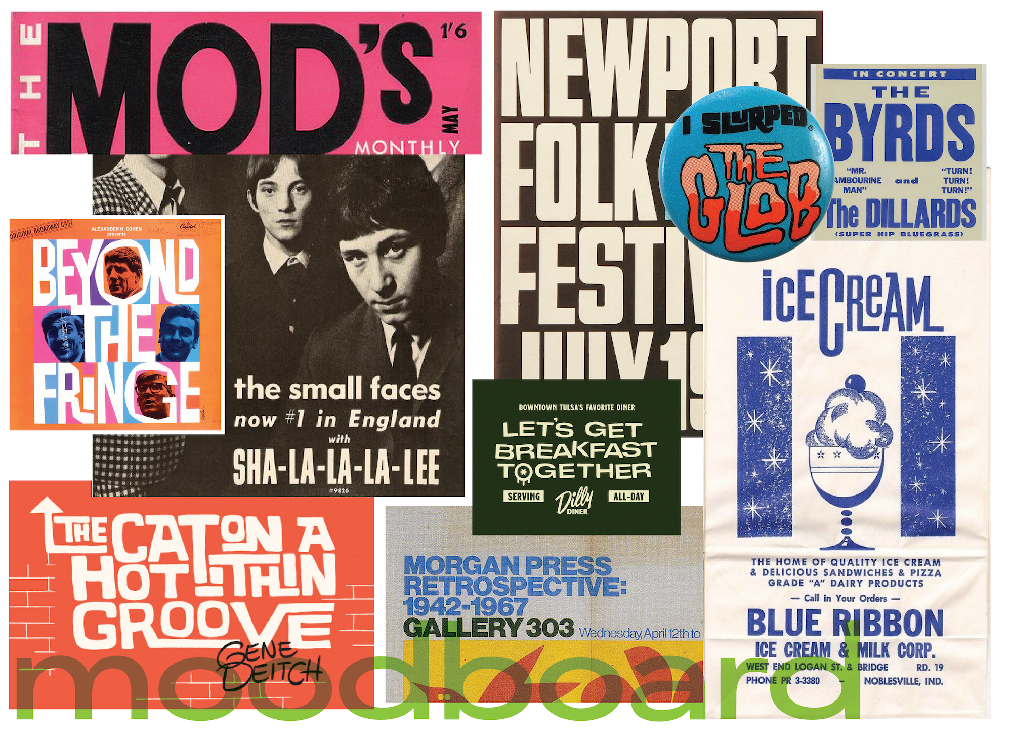
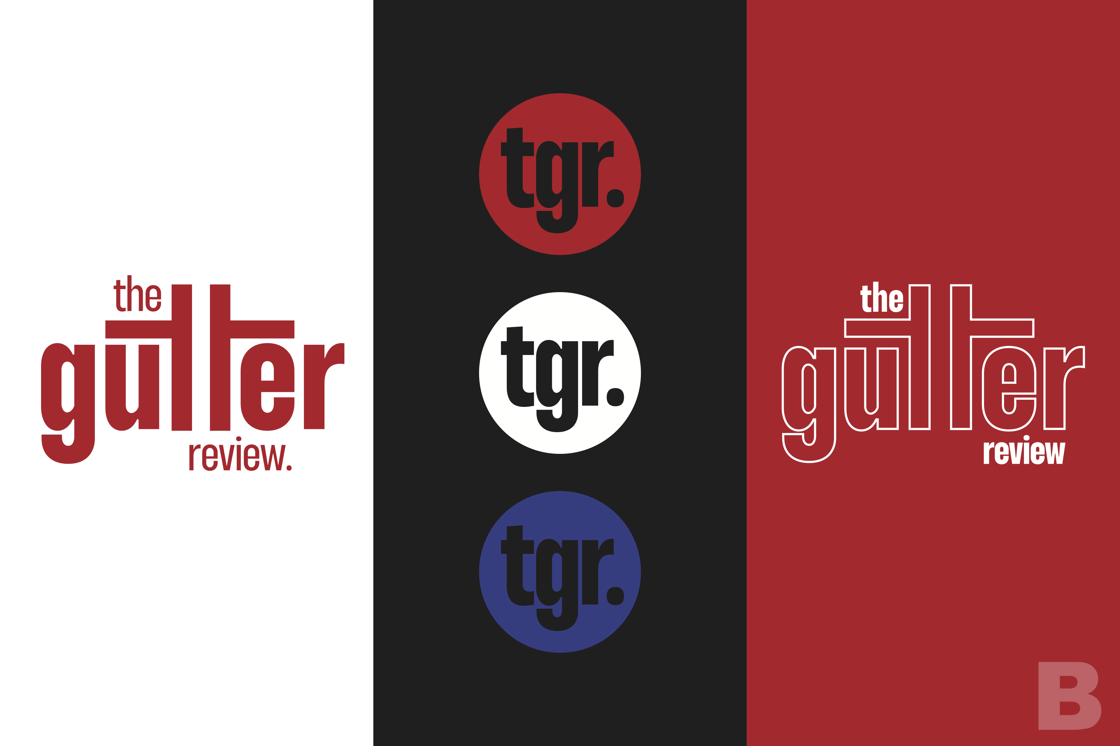
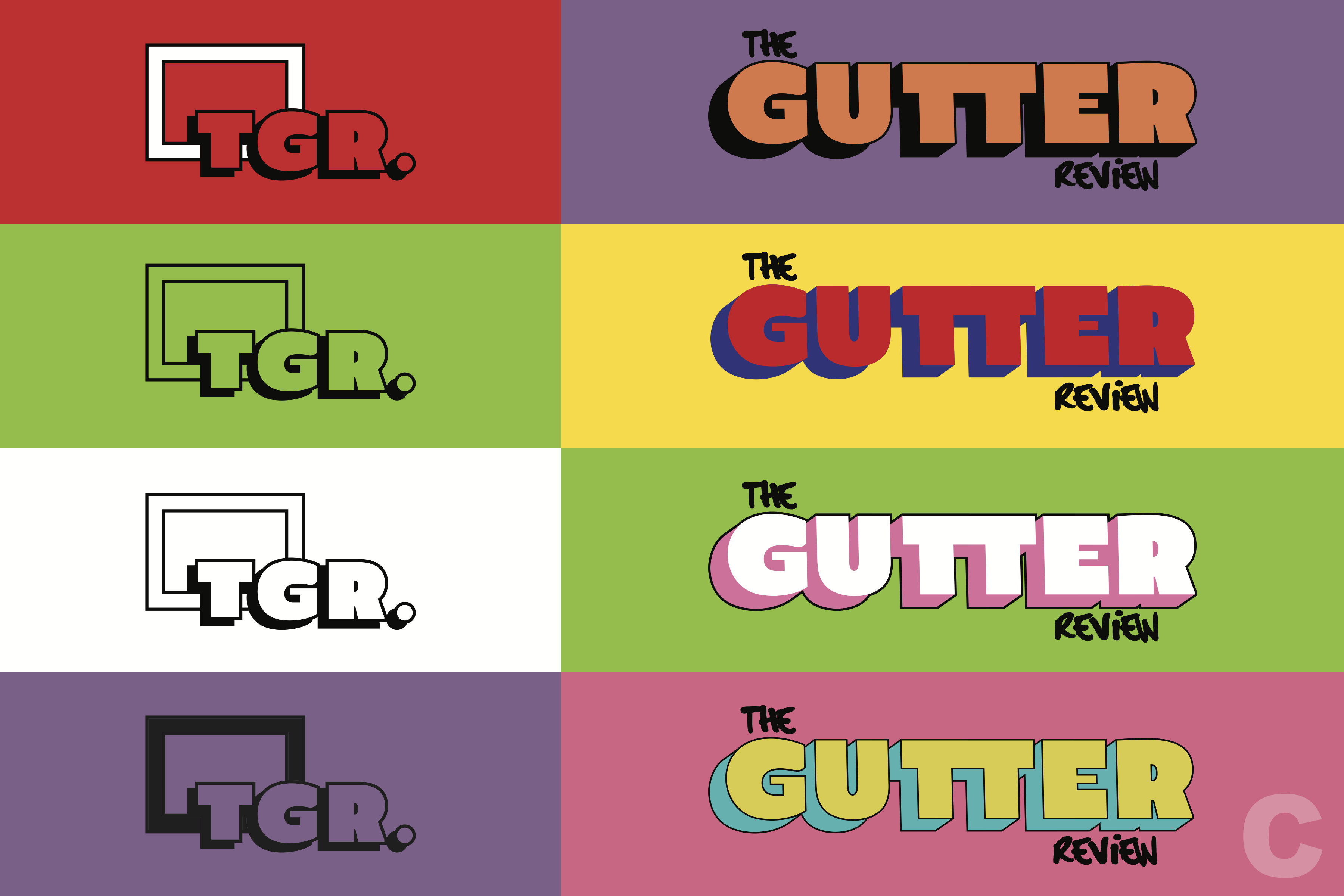
When presented with the above four logos ideas, the owner of the journal chose option "B", saying that it gave them mod/mid-century vibes. I put together another moodboard with some interesting visuals that really summarized what I took "mod" typography to mean, and then worked to capture this look for the journal. The project is still in progress.
